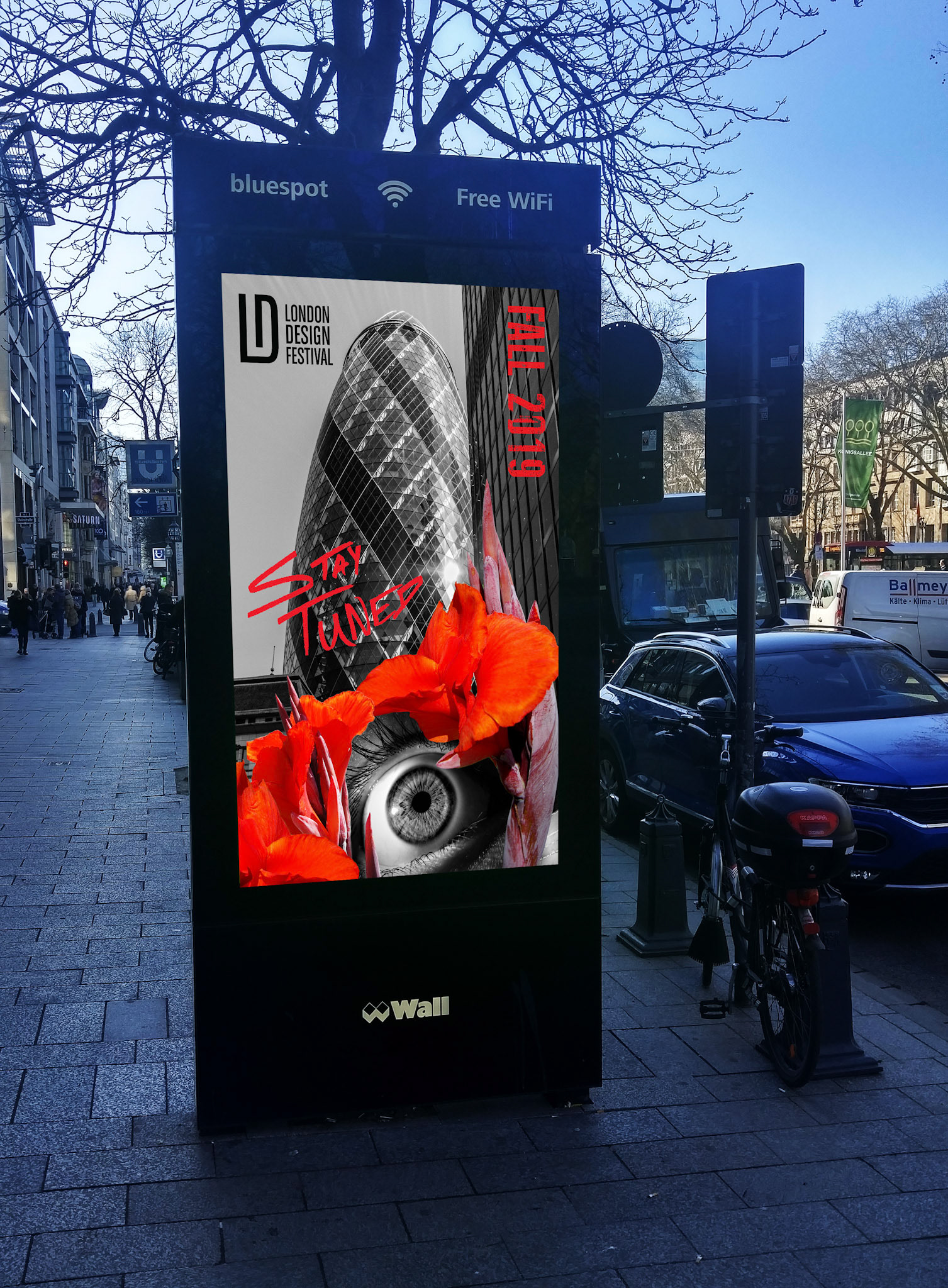
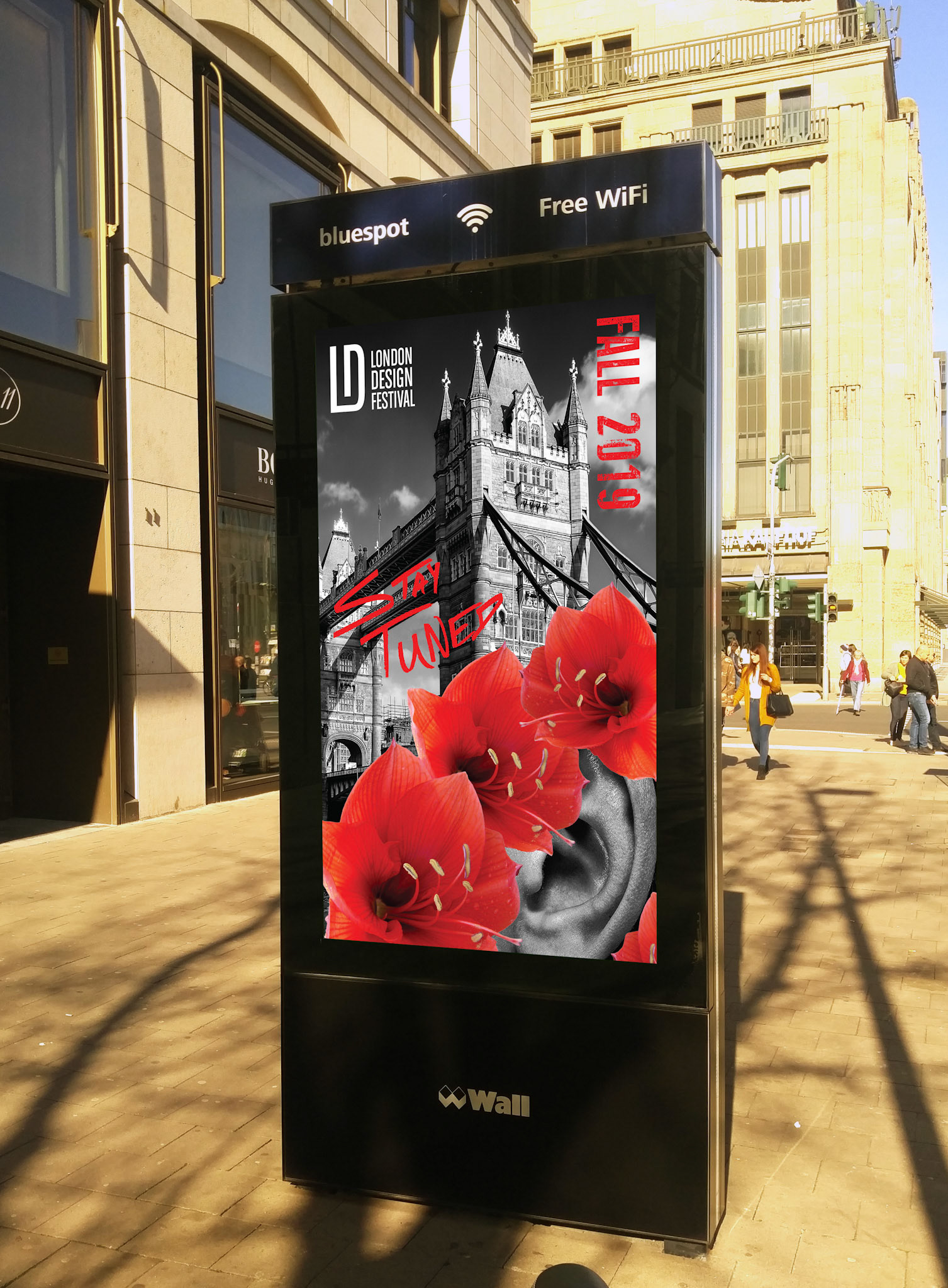

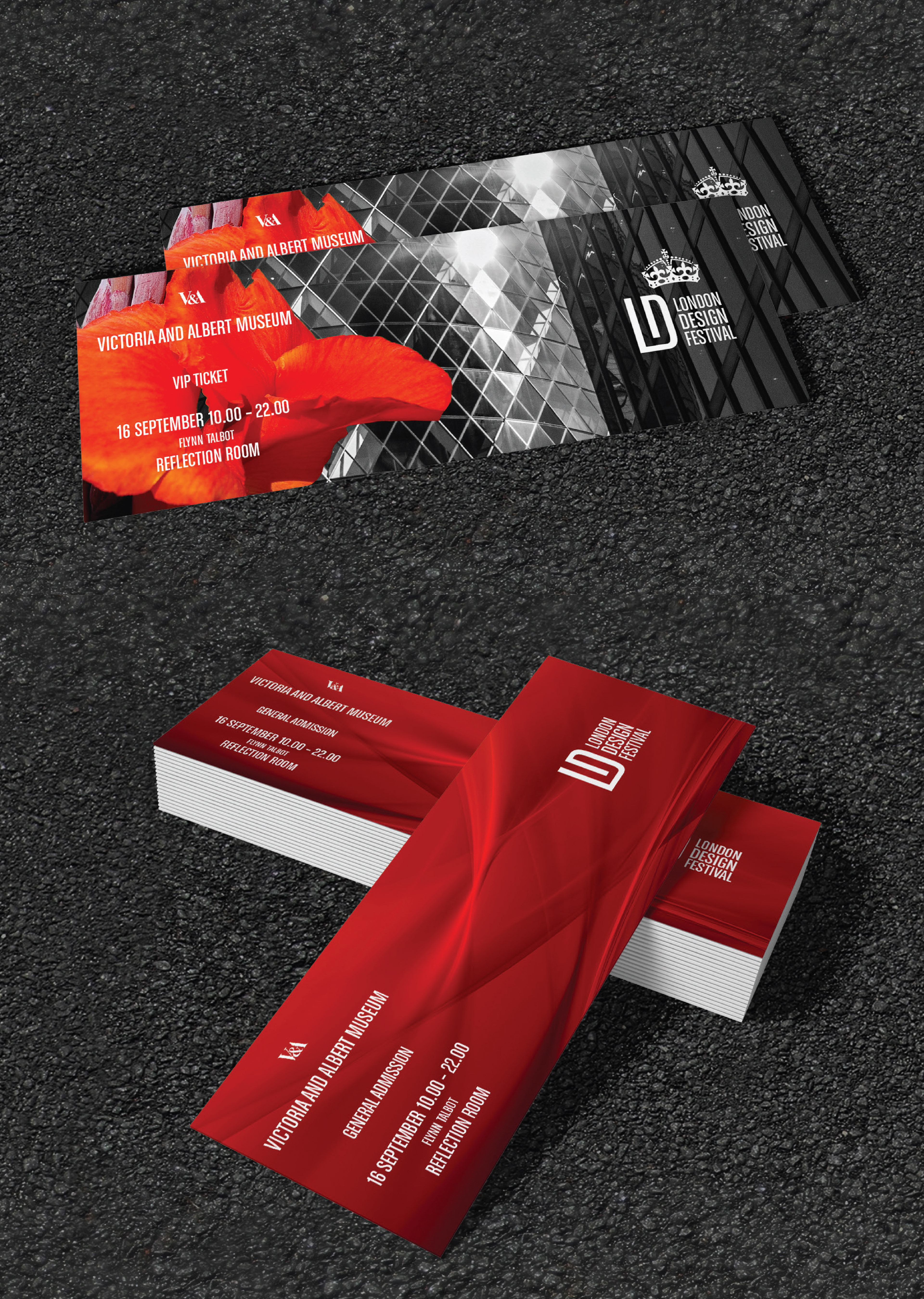
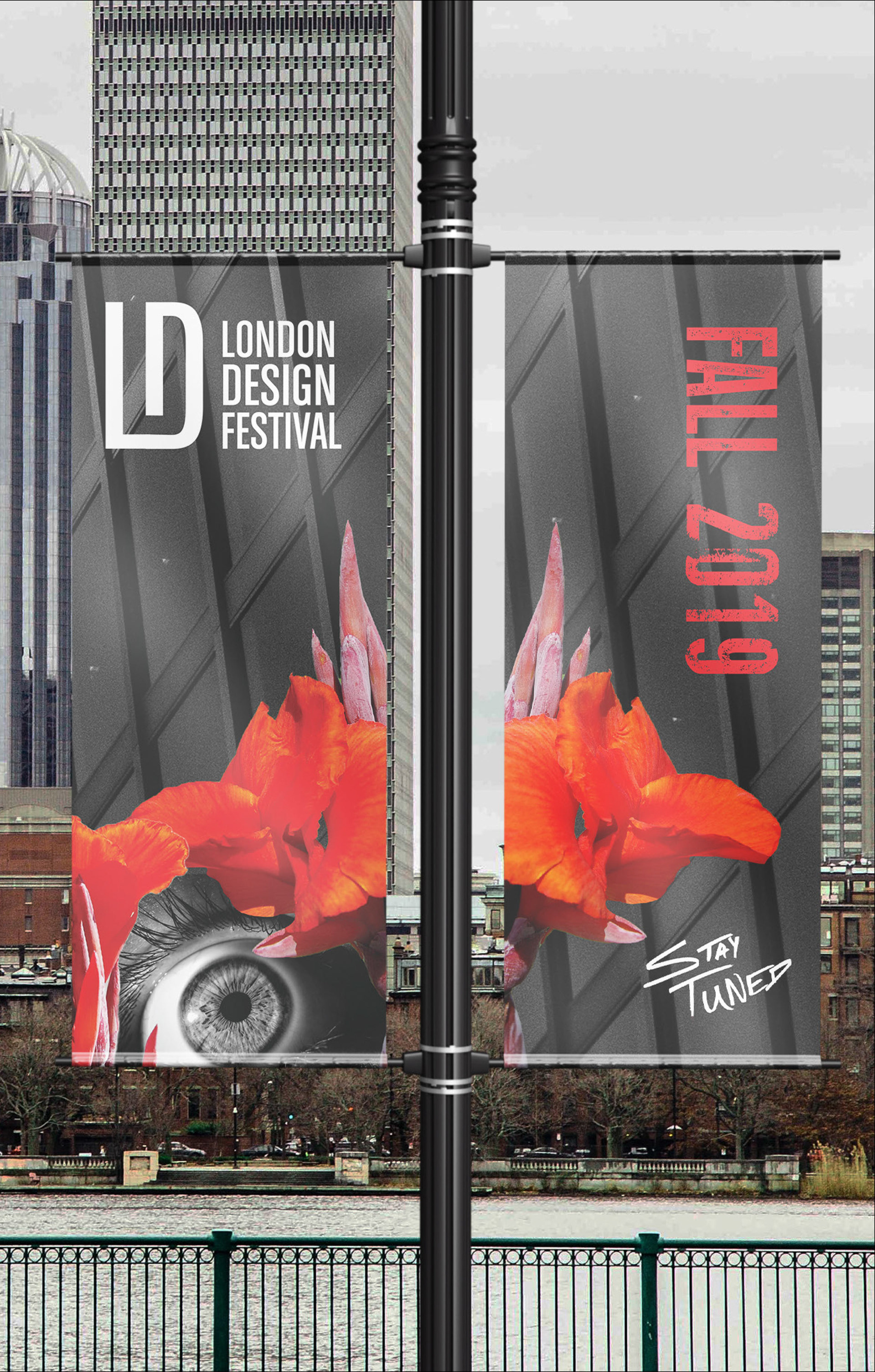


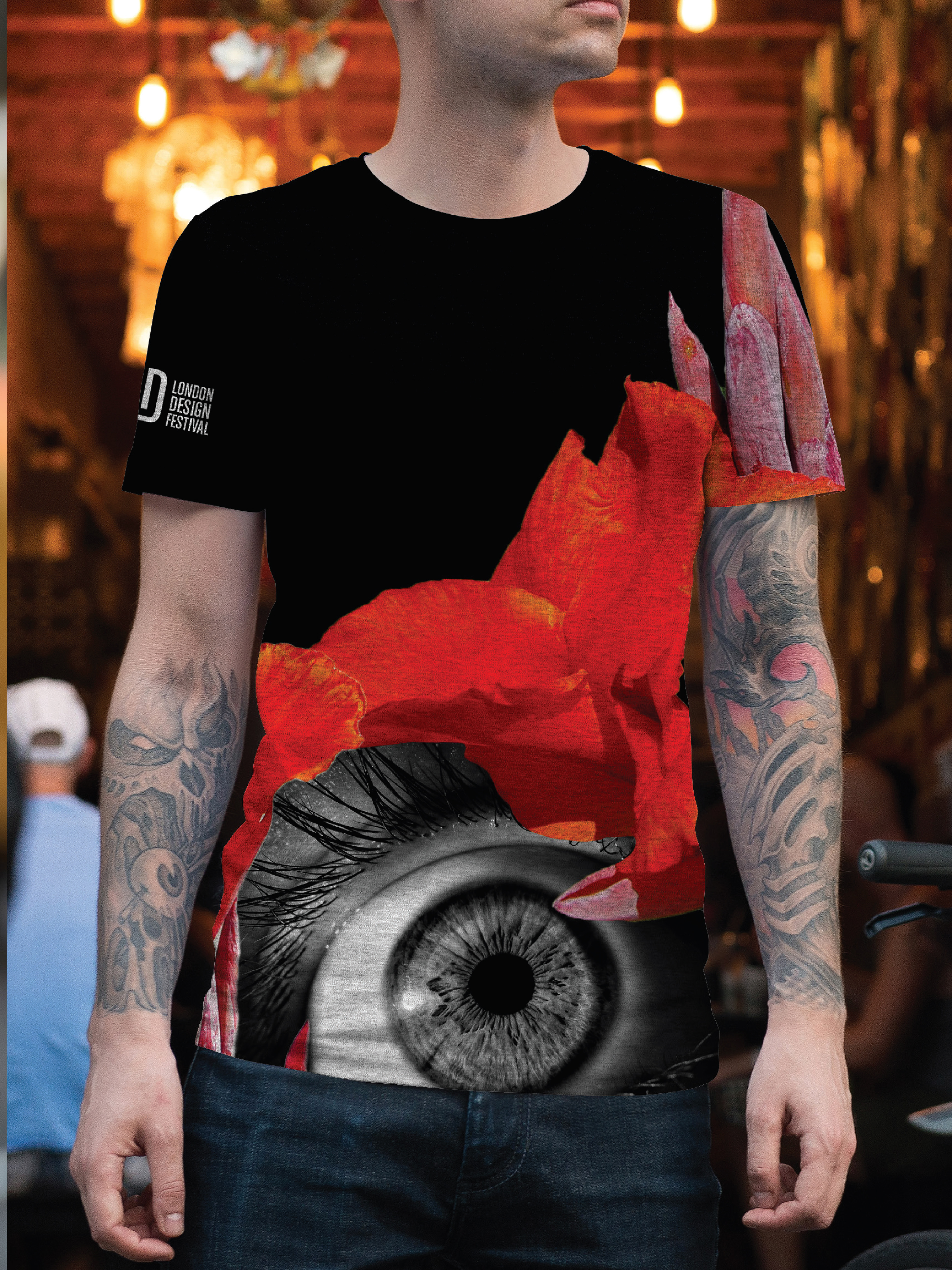


This branding project employs the elements and principles of design to represent the creativity that exists within the London Design Festival. The modern fonts alongside the sharp red and black colors are interlaced with floral patterns as a representation of the beauty and magic of creativity. The flowers serve as a metaphor for the brief lifespan of beauty. Just as the London Design Festival only lasts for nine days, beauty is fleeting. Meanwhile, the close spacing of “L” and “D” in the logo designates the unification between the city of London and design. The color red is selected as the color of London, while sights of London – Big Ben, the London Bridge and the Gherkin – represent the festival’s mission to promote this city as the design capital of the world. Throughout this project, human body parts are intricately placed with reference to the rule of thirds and golden section of typography, such that their importance is undeniable. First, the human eye – both piercing and haunting – begs viewers to open their own eyes to wondrous creativity in their world. Second, the human ear invites viewers to listen for the authenticity that the London Design Festival exudes through its dedication to inventors and aficionados of design in all forms. Lastly, the human mouth offers a striking contrast of rich lips and brilliant white teeth, thus speaking to an event that is both opulent and pure. The human elements within the design exist in the foreground, while the structural features of London fill the background. Such careful attention to positive and negative space tells this story to the viewer: London will be the topic of the festival, but the stars of the festival will be its people, including each visitor.